
12/05/2025
"The Monarch" Brand (c. 1970s)
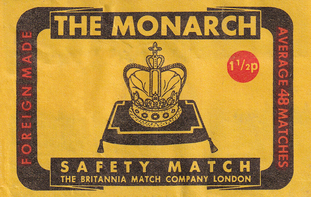
1½p for't match? Chuffin' Nora!
Our first relatively contemporary label today! I suppose compared to our previous labels it doesn't exactly scream “1970s”, (there are some more gaudy ones we’ll surely see at some point) but there is a reason for this.
In England currency changed in 1971 when it was “decimalised”. We won’t go into too many details, but for us today the relevance is that in order to adapt the price of low-cost items effectively, a half penny coin was minted. During the mid-1970s Britain experienced significant inflation, and the price of necessities such as matches rose. It might not seem like a lot today but it was at the time for these kinds of objects.
Anyway! The earliest date we can put on this label is 1977, as that’s when The Britannia Match Company was incorporated. So late 1970s to the early 1980s. The more modern we get with matchboxes the easier it is to date them generally speaking, it makes for a nice change of pace!
Something I quite like about this design is the incidental humour that comes with it. During this time very quintessential and patriotic matchbox designs were common, as Britons were dealing with inflation and other difficulties. Many brands reinforced British patriotism to garner attention and favour, “old reliable”, as it were. Though a funny element here is the prevalence of this proud British design in combination with the "Foreign Made” text on the left side, as it sort of undoes the sentiment a tad (also too proud to note where the matches were made!)
I personally don’t find these designs quite as interesting. This one here is trying to replicate older British designs from the golden era — with yellow, black, and red colours. Again for the reasons of tapping into British pride, but just don’t end up being as appealing, as they’re effectively just an imitation.
Interestingly it seems the red text that flanks the centre has been coloured in by highlighter (at the factory presumably). It must’ve originally been yellow and perhaps not as striking (haha) as it needed to be.
Dearest reader, do you prefer these texts to be long like this one or on the shorter side? Let me know! Thank you for rumbling all the way to the bottom of the page in any case!