04/05/2026
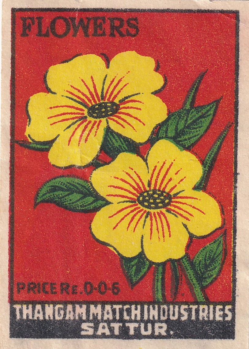
"Flowers" Brand (c. 1950s)
Bloomin’ ‘eck, we’re late!
Wowsers trousers! It’s been months! Well, months for me, perhaps only seconds for you! Maybe that’s time travel in an abstract way.. Anyway! We’re off to India today, where we find some of the most vibrant and colourful matchboxes!
As we can see, this label was produced by Thangam Match Industries in Sattur, a fairly small town in Tamil Nadu. Matches have been made here since 1922, with manufacturing typically being run by entrepreneur family units more often than the large-scale productions you would typically expect. Matches are still being produced there today!
As for dating our label, we can narrow it down quite nicely this time thanks to the price. Here the price is still listed in pre-decimal, where "Re. 0-0-6" means 0 Rupees, 0 Annas, 6 Pice (1 Rupee = 16 Annas = 64 Pice). This pricing structure only existed between 1950 and 1957 in India, so we have a solid decade to place it in! Interestingly, the price of 6 Pice is so low, that in today’s currency it would be 1/10th of a single US cent.
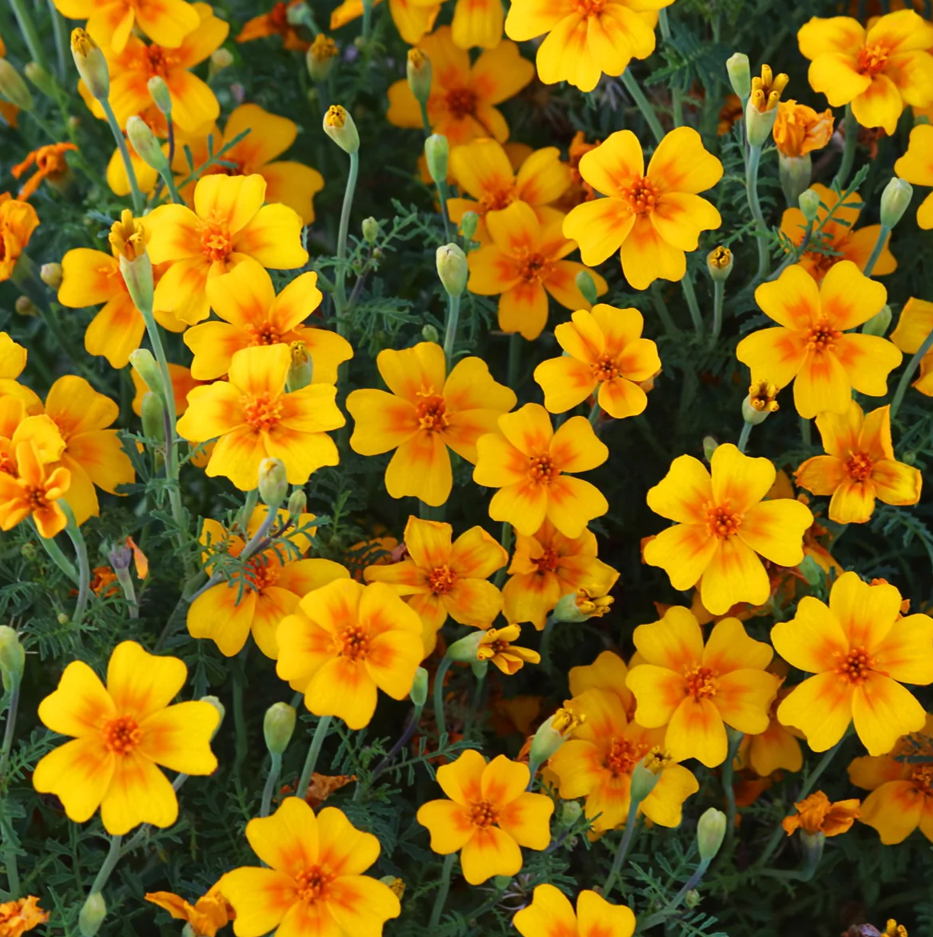
Trying to pin down the flower itself is a little tricky, but I would tentatively identify it as a Tangerine Gem Marigold. They have a bright yellow colour with an orange gradient on the inner petal. The red lines seem to be a simplification of this gradient effect, and the shape and number of the petals match too. The leaves don’t completely seem to match, but ultimately it is a simplified artistic rendition, and certain elements may be a bit off, or it could just be a different flower! India does produce a huge amount of Marigolds though, so Tangerine Gem makes for a rigid contextual and visual match.
While flowers might not be a particularly exciting object for a label amongst the swathes of more esoteric subjects, it is quite an ideal one to introduce India. Indian labels from the golden age focus on bright, rich colours and culturally significant subjects, and what would be more natural and perfect than a flower! The harsh primary colours are very eye-catching and contrast well together from an advertising standpoint, so I imagine this design was probably quite successful in the 1950s!