12/08/2025
"Miko Coffee" Brand (c. 1950s)
A Belgian brew, just for you!
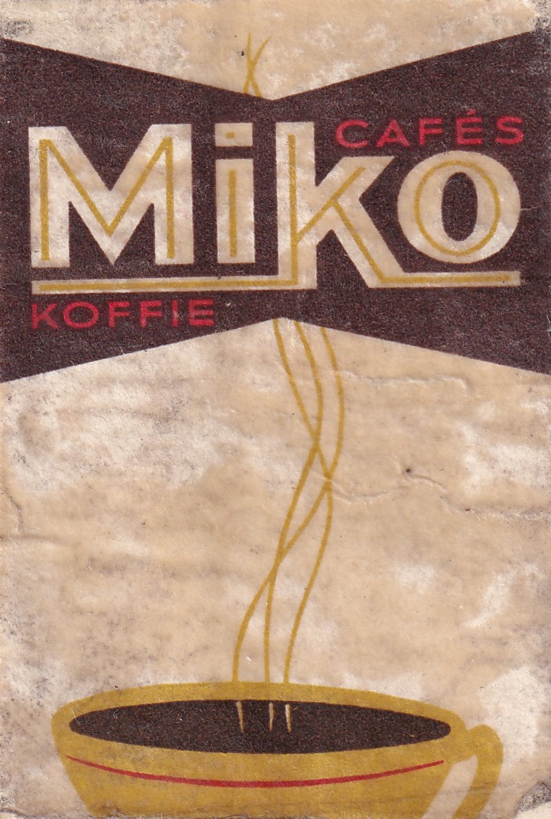
Another advertising label! I must say though this example here is in quite rough shape, the background is meant to be white, it actually looks like it was stained with coffee!
Belgium was and is quite famous for its coffee, and during the 60s and 70s this element was greatly capitalised on in advertising, resulting in many coffee-themed matchboxes especially. These were often given to restaurants and cafés as a small way to keep the brand relevant in people’s lives at the time.
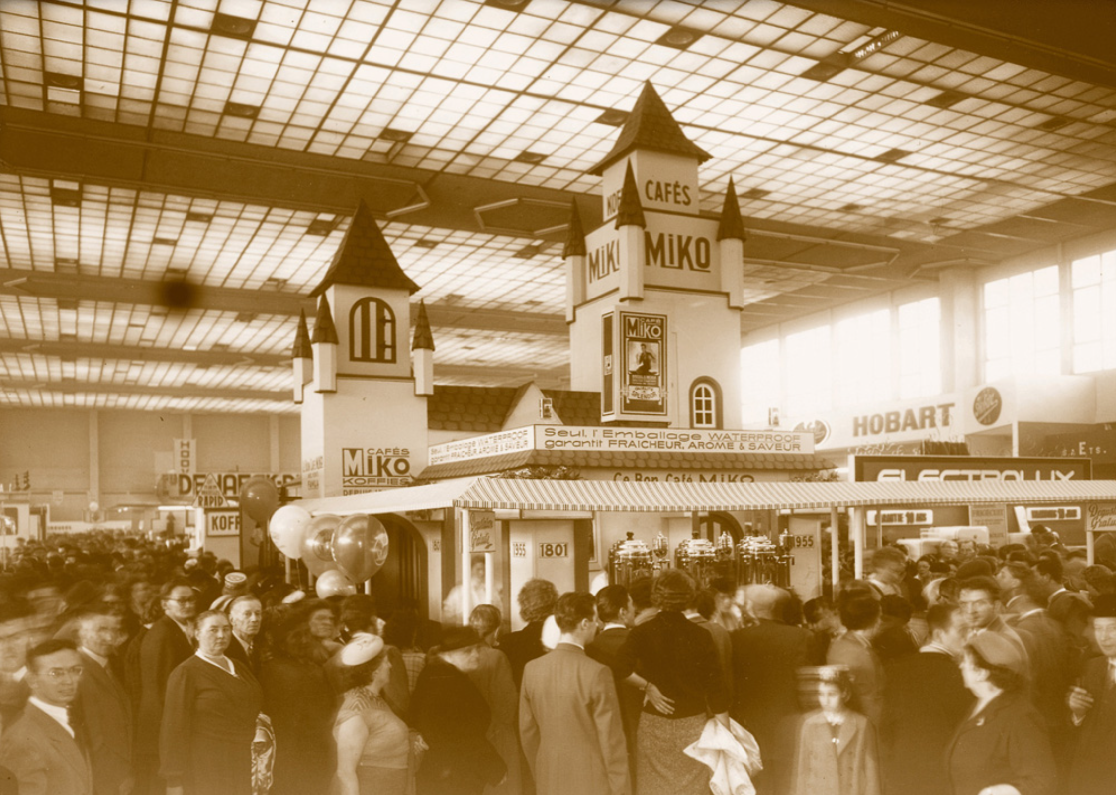
Miko was founded in 1801, but didn’t start in the coffee business until 1900, where they saw tremendous growth and success. During the 1950s their logo / slogan was “Cafés Miko Koffie”, which lines up with our label here, so I think we can place this one around the mid to late 1950s.
I really like the simplicity of the design here, the coffee steam strands lining in the Miko logo, the white and brown colours keeping in line with the coffee theme, and again we have red highlighted in, I wonder why, I’ll have to research this.. If I come up with anything I’ll let you know!
Because of this label I made myself a coffee, I’m quite a coffee fan, but more in a functional way. My favorite coffee is simple, a little bit of milk, no sugar, cheap instant coffee. There’s something nostalgic about it, it’s what my dad used to make, and the feeling that comes with it enhances the coffee beyond what any gourmet brand could do I think.