12/03/2025
"Boni Match Extra Quality" Brand (c. 1920s)

A Boni-fide classic!
Another new country today, hooray! I have some catching up to do.. Life is a bit irregular sometimes, though if we really think about it most people would probably prefer it that way. Anyway, back on track!
Today we have the Boni Match! Boni has many interpretations that tangentially link to our label today. Due to the proximity, however, the name simply relates to the French word boni, which means “bonus” or “profit”, in context implying a higher echelon of quality, or a premium product. Though the word boni also derives from the Latin Boniface, meaning “good” or “auspicious,” so an all-around positive connotation. It certainly must’ve made customers feel like they were getting something extra when buying this brand.
The red text at the bottom requires a little more sleuthing, but it's not too tricky! The full breakdown is Etablissements Frères Colruyt Société Anonyme (Colruyt Brothers Establishments, Public Limited Company), based in Halle, Belgium. This was a family business owned by multiple brothers apparently, and despite being a relatively small group they were remarkably successful, even challenging larger consolidated companies for match-related dominance. Incidentally they also have nothing to do with the modern Colruyt Group, also based in Halle today.
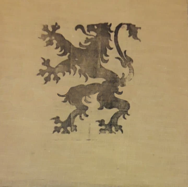
The main centrepiece may be rather plain as a marking, it’s fairly typical and very common in European culture. It displays a “Lion Rampant”, rampant is a heraldic term in this context meaning that the lion is standing upright. This one in particular though is the Leo Belgicus (Belgian Lion), the primary heraldic symbol of the entire country. The lion is usually gold with a black background, but the inverse is also used on flags and shields. This lighter colouration for the label makes sense here, as a full black box may be a tad imposing, so using the inverse colours makes sense here I think.
In terms of the date this time around it's a little unclear precisely, though the font and typography place it prior to World War 2, so it was likely made between 1910 and 1940. I would (in my relative ignorance) narrow it down to 1920 or 1930, as this style of lion was popular on pennants at the time, and these pennants usually had a similar tan background colour. The lion was also drawn in this more “fluffy” style, with licks of fur curling off its arms and legs. The tail is also slightly plant-like as well, a motif that seems to be fairly common in these designs. I’ll include an example of this style of lion at the bottom of the page so you can see what I mean.
A very quintessential but great label today! Belgium was prolific in the matchbox space during the early 1900s, it’s been fun to cover this classic. Overall I like the design, it's simple and effective. The red text makes the sentiment really pop, and this combined with the national symbol must’ve instilled a sense of pride in those who made it and bought it. Quite a clever strategy too I think, it’s like saying “our country’s products are high quality”, and in a market flush with export brands, that kind of sentiment would absolutely keep the Belgians on side, and cement Belgian matches as a hallmark of quality on the world stage!